An enterprise design system that ships as a product.
A 3-tier tokenized design system — 288 Figma Variables, 179 governed components, published as a real React library and consumed by a working banking dashboard, with Figma↔code mappings authored in Code Connect and WCAG-AA tokens. Designed, engineered and governed end-to-end, by one person.
→ SURFACES10 functional product screens · 179 Figma components/sets · one published code library.
00 / OVERVIEW
One system, two surfaces, kept in sync.
Most "design systems" are sticker sheets. Meridian is a single source of truth that drives both the Figma files and a running product — I built it end-to-end to prove I can operate one, not just draw one.
meridian.app/overview
179
governed components · screens are instances only
288
design tokens · 3 tiers, Light/Dark
779
instances placed · 0 hand-drawn
27
components bridged to code · Code Connect
100%
app UI assembled from the library
THE DESIGN SYSTEM
288 tokens, one toggle.
The component library, rendered from the shipped React code. Flip the mode and all 81 semantic tokens re-theme together — light to dark in a single move.
jestaz-design-system
LIVE REACT COMPONENTS · THE DEMO'S AI RUNS A DETERMINISTIC MOCK; THE REAL OPENAI 4-AGENT PATH SHIPS IN THE CODE.
THE FIGMA FILE
Built solo — nine pages, 179 masters, governed.
The source of truth: a structured Figma file with multi-mode Variables, variant sets, component properties and an icon library. Foundations and the Button set, straight from the file:
Every component in that file is rebuilt as real React code — the full library, all 35+ components and their variants, is in the design-system section above with a working dark-mode toggle.
01 / THE THESIS
Proof you use a system, not just make one.
The hard part of a design system isn't the components — it's the discipline that keeps design and code one thing as the product grows.
→ 01 / TOKENS
Nothing is hard-coded.
Every color, radius and space binds to a variable. Change a token once and both Figma and the live app move together.
→ 02 / INSTANCES
Screens are composed, not drawn.
In Figma, screens contain only instances. In code, pages import only library components. No hand-built blocks on either side.
→ 03 / THE BRIDGE
Design points at code.
Code Connect maps each Figma component to its real code component, so Dev Mode shows the exact import + props.
02 / THE SYSTEM
Tokens → Components → Patterns → Product.
01 · TOKENS
One source, two surfaces.
Primitives (118) → Semantic (81, Light/Dark modes) → Component (89). 288 Figma Variables across 3 collections mirror exactly to CSS variables + a Tailwind preset in code. Flip the Semantic mode and the entire product re-themes.
02 · COMPONENTS
Built once, in the library.
179 components/sets in Figma. The product consumes a focused set, each a real export in @jestaz/design-system.
ButtonVariant × Size
KPICardTrend up / down
BankCardchip · masked PAN
Badge6 tones
Input4 states
NavItemactive
ChatBubblerole
Chartsarea · donut
03 · PATTERNS
Composition with discipline.
Top bar, sidebar nav, page-header cards, page states, stat groups — all components, never loose frames. Screens assemble from instances only.
04 · PRODUCT
The system in use.
A Meridian Bank treasury dashboard — 10 screens, a detailed simulated user, and a 4-agent AI layer (Analyst · Risk · Forecaster · Advisor). The app imports 100% of its UI from the library; the page files are pure composition.
TOKEN ARCHITECTURE
Three tiers, one resolution path.
A component never references a raw color. Every value resolves Primitive → Semantic (mode-aware) → Component — so a brand change or a theme flip is one edit, not a migration.
① PRIMITIVE · raw scale
color/primary/50
color/primary/300
color/primary/500
color/primary/700
118 variables · value only
→
② SEMANTIC · Light / Dark modes
color/bg/brand-bold → primary/500
color/text/brand → primary/700
color/text/primary → neutral/900
color/bg/surface → neutral/0
81 variables · 2 modes
→
③ COMPONENT · scoped alias
color/button/primary-bg → bg/brand-bold
color/button/primary-fg → text/on-brand
color/input/border → border/default
89 variables · alias only
Naming is color/category/role-state — color/button/primary-bg-hover, color/text/secondary, color/border/default. Components alias Semantic; Semantic aliases Primitive; a primitive never appears in a component. Flip the Semantic collection's mode and all 81 tokens re-resolve at once — that's the dark-mode toggle in the live library above.
ADVANCED FIGMA
Built with Figma's system primitives — not hand-drawn frames.
This is where the design-system craft lives: variables with modes, real component sets, component properties, an instance-swapped icon library, and Code Connect.
→ VARIABLES · 3 COLLECTIONS
288 variables, Light/Dark modes.
Primitives (118) → Semantic (81, Light/Dark) → Component (89). One mode toggle re-themes the whole product — tokens, not styles.
Button exposes Leading/Trailing icon (BOOLEAN) and icon source (INSTANCE_SWAP); NavItem swaps its own icon. No baked-in glyphs.
LabelLabelLeading icon ⇄ on/off
→ ICON LIBRARY
One component per icon.
A dedicated Icon/ library, instance-swapped into buttons, nav and inputs — referenced across the system, never re-drawn.
Icon/…
→ AUTO-LAYOUT · GOVERNANCE
Screens are instances only.
179 masters across 9 pages (Foundations, Primitives, Components, Patterns, States, Data Table, Auth, Dashboard). If it can appear twice, it's a component.
179 masters · 779 instances · 0 hand-drawn
→ CODE CONNECT
27 components mapped to real code.
Each maps to its React export with variant→prop translation — engineering copies a working component, not a redraw. (Publish to Dev Mode is gated to Org/Enterprise plans; mappings are committed and publish-ready.)
Code Connect maps each Figma component to its React export and translates variant props to code props, so Dev Mode shows the real snippet for that node — handoff with zero re-draw. Status, plainly: 27 components are mapped and committed (code-connect/*.figma.jsx — the real file is shown below) — every component the code library implements, each bound to its Figma node with variant→prop maps. The remaining Figma components are screen-level compositions, not standalone code exports, so there is nothing to bind. Going live in Dev Mode is gated to Figma's Organization / Enterprise plan — I verified this directly against Figma's publish API on my Full seat: the mappings validate, the plan tier is the only gate. The repo ships publish-ready — one command, npx figma connect publish, the day the file sits on an Org plan. I left it un-published rather than overstate it.
↓ ON LOOP — ONE COMPONENT RESOLVING: VARIANT → CODE PROP → THE TOKENS IT BINDS.
Real contrast ratios from the shipped semantic tokens (computed, not estimated):
Pair
Ratio
Level
text/primary on bg/surface
17.5 : 1
AAA
text/secondary on bg/surface
7.1 : 1
AAA
text/on-brand on bg/brand-bold
5.5 : 1
AA
brand/fg on brand/subtle
7.4 : 1
AAA
success/fg on success/bg
5.1 : 1
AA
danger/fg on danger/bg
5.3 : 1
AA
text on surface · dark mode
16.4 : 1
AAA
Status is never color-only — every badge and trend pairs an icon + label with the color. Interactive components carry a brand focus ring (Button, Input, Tabs, nav).
GOVERNANCE
A system you can contribute to, not just admire.
The one rule
If a piece of UI can appear twice, it's a component — never a hand-drawn frame. Figma screens and code pages are composed only of instances / imports. Tokens are never hard-coded.
Adding a component
Reuse-check the library first.
Build the Figma component + React export together.
New value? add a Semantic token, alias it in the Component tier.
Author the Code Connect mapping; publish on the next release.
The rules live in a committed governance skill (jestaz-ds-governance) so every future change — by me or an agent — stays component-driven, token-bound and instances-only.
04 / FEATURE WALKTHROUGH
Not screenshots — working features, each explained.
Three of the ten screens, in action — read what each does, then watch it happen.
→ AI ASSISTANT
A 4-agent treasury copilot, grounded in the data.
Ask in plain English; the question routes to the right specialists and the Advisor answers — with the agents it used shown as tags.
Tap a suggestion — “Analyze cash flow”, “Find unusual expenses”, “Forecast Q4”.
Routes across Analyst · Risk · Forecaster · Advisor.
Right rail surfaces live AI insights & recommendations.
meridian.app/assistant
→ TRANSACTIONS
A sortable, filterable data table.
Search, filter and page through activity across accounts — every cell built from library components.
Search by merchant or category — rows update as you type.
Cycle the Status filter (All / Completed / Pending / Failed).
Badge tones encode category & status; paginate the footer.
meridian.app/transactions
→ PAYMENTS
A guided transfer flow that totals as you type.
A four-step stepper, a transfer-details form, and a Review card that recomputes live.
Switch the From / To accounts.
Edit the amount — the Review summary updates instantly.
Stepper: Account ✓ · Verify ✓ · Fund · Review.
meridian.app/payments
The full set — all ten, every one pure composition over the library:
OverviewKPI cards · chart · donut · AI insights
Accountspage-header card · data table
CardsBankCard · freeze switch · limit bar
Paymentsstepper · form · review card
Transactionsfilters · table · pagination
Reportsstat cards · report table
Insightsstat cards · chart · key insights
AI Assistantchat · agent tags · sidebar
Settingstabs · toggle rows · save bar
Supportcontact form · FAQ · live chat
05 / DECISIONS & TRADEOFFS
Every choice is a killed alternative.
→ THEMING
Semantic modes, not duplicate dark components.
Chose: one component set; dark is a mode on the Semantic collection. Cost: every component must bind to semantic tokens — discipline upfront. Win: theming is one toggle, zero duplication, 81 tokens re-resolve at once.
→ VARIANTS
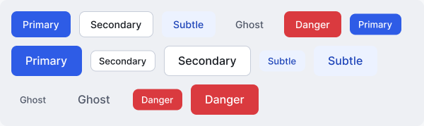
One variant set, not many components.
Chose: Button = Variant × Size (15). Ruled out: separate Primary/Secondary components — the matrix would sprawl. Guardrail: icons are instance-swap + boolean props, not new variants, so the matrix stays small.
→ ICONS
One component per icon + instance-swap.
Chose: a dedicated Icon library, swapped into buttons / nav / inputs. Ruled out: baked-in glyphs (un-swappable, duplicated). Cost: more components; win: one source, referenced everywhere.
→ THE PRODUCT
The app imports the library — no local UI.
Chose: the dashboard consumes @jestaz/design-system; pages are pure composition. Cost: a real package boundary to maintain. Win: proves the system is consumable, not just drawable.