Iteration is the proof that the product is being validated by real people, not assumed from the inside. Each release below pairs an actual quote from a beta tester with the design / engineering response that shipped in answer. The point isn't speed — it's that the loop is closed: feedback in, fix out, ship, repeat. Nothing reverse-engineered for the case study.
01
"This app keeps recommending closed restaurants."
Hard-filter rule: drop only confirmed-closed places from Google's openNow; keep unknown hours in the pool but bias them lower. Pool got smaller, pool got more honest. Three days later this got smarter: Stage 2 computes "open now" locally from the cached weekly schedule.
02
"It just showed me a strip club."
Three-layer venue filter: primary-type denylist (night_club, casino, adult_entertainment), secondary-type denylist (any matching tag), and a name-token blocklist for places whose primary type lies but whose name doesn't. Plus excludedTypes pushed to Google at fetch time.
03
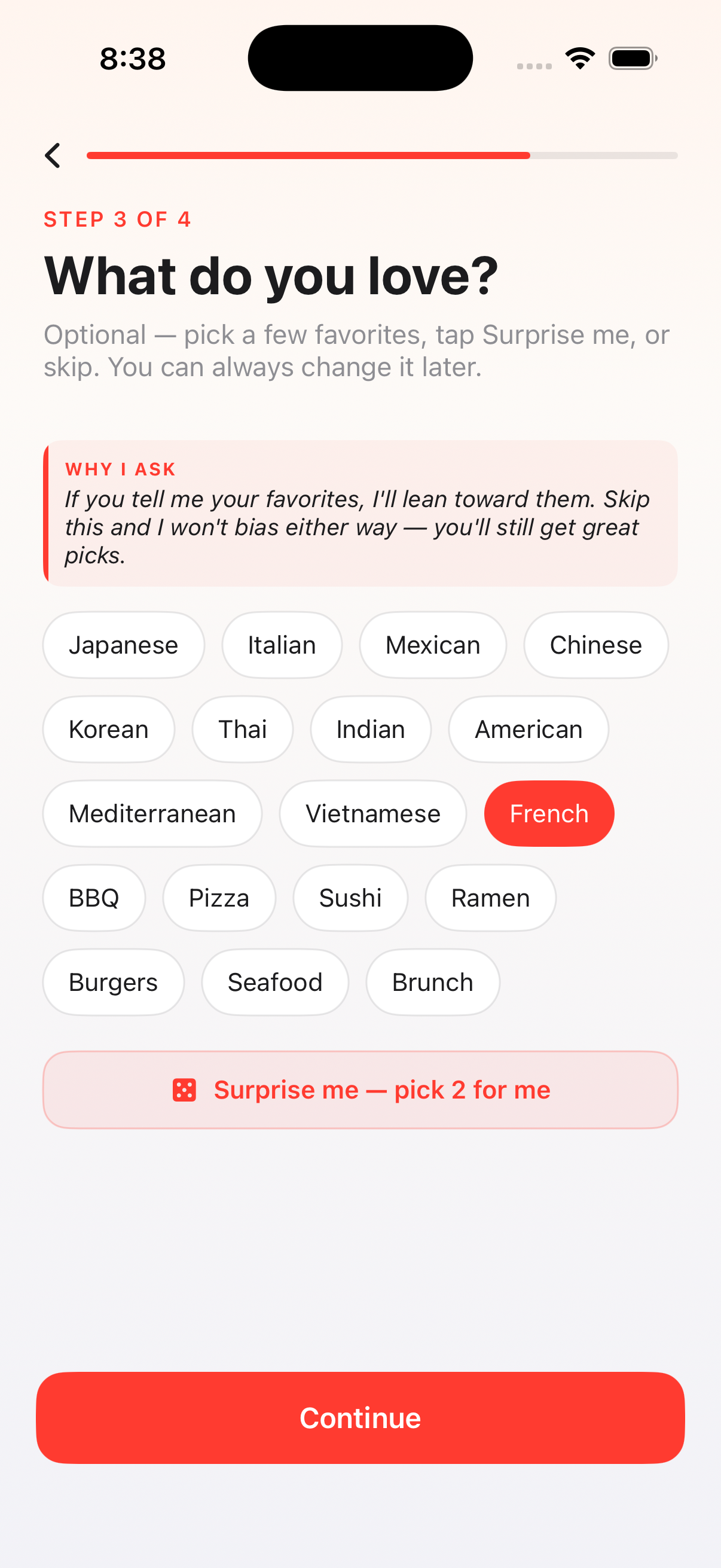
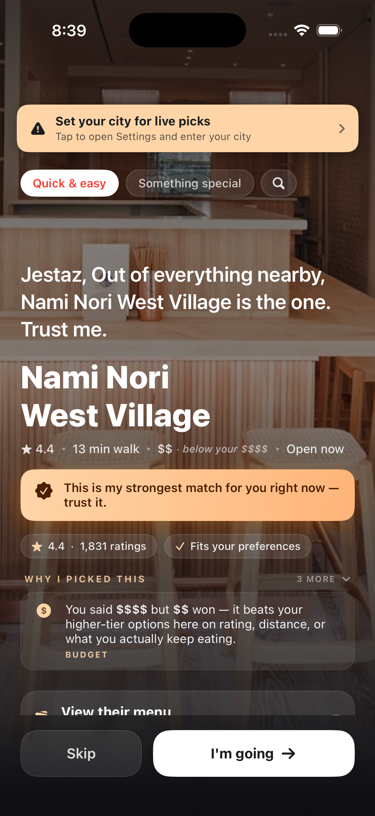
"After I changed the budget, the same restaurant came back."
Four moves at once: heavier price-tier weight in the scorer, a much larger visible $$ badge, a "Still your top pick" confirmation chip when re-ranking legitimately picks the same place, and a -25 recently-presented penalty so cold relaunches don't always land on yesterday's pick.
04
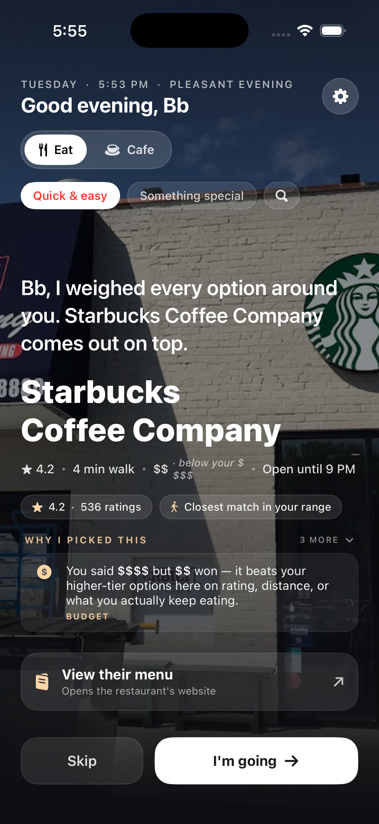
"Why did you pick $$ when I said $$$$?"
The budget honesty fact: a dedicated reasoning row appears when the pick is off-tier — "You said $$$$ but $$ won — it beats your higher-tier options on rating, distance, or what you actually keep eating." Sticky (AI narration can't replace it), visible the entire time the pick stays on screen.
05
"I kept tapping Skip and the screen froze."
Two-layer freeze defense: 5-second timeout race around every AI call (TaskGroup against a sleep), and a 2.5-second LoaderOverlay kill-switch that force-hides any stuck spinner. The unhappy path now has the same care as the happy one.
06
"What's this 'Range requires lowerBound <= upperBound' crash?"
Triple-layer markdown defense: escape every dynamic field with a markdownSafe extension, balance-check ** / _ counts at the AttributedString.markdown() entry, and sanitize AI-generated reasons before they reach the parser. Same crash had recurred — this stop-shipped it.
07
"The more I use it, the less API budget should burn."
Cost optimization Stages 1 + 2: multi-pool cache (8 LRU signatures) so toggling cuisines is free after the first visit, plus 24-hour cache backed by locally-computed open/closed math. Combined cumulative API savings: ~60-80% depending on session pattern.
08
"What if there's a storm — won't hours be wrong?"
Stage 3 — WeatherKit emergency refetch. Severe / extreme weather alerts at the user's coordinate enter the cache signature, automatically busting the 24-hour cache exactly when local schedules become unreliable. Home banner: "Winter Storm Warning — hours may vary." Honest signal, free API.
09
"App crashed in Foundation Models again."
Crash-crumb pattern. UserDefaults flag set before each AI call, cleared on normal return. Next launch sees it stuck → previous run died inside Apple's framework → disable AI for this session, escalate to permanent after two strikes. App never crashes inside the same Apple bug twice in a row.
10
"I want to find a cafe to sit and work from — not a restaurant."
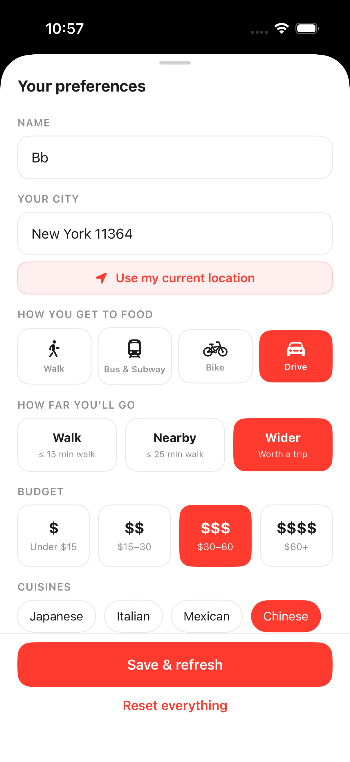
Cafe as a parallel app context. Eat / Cafe pill at the top of Home switches the entire experience. The two modes share the UI shell and almost nothing else: different Google fetch (cafe / coffee_shop / bakery / breakfast_restaurant types, with restaurant excluded by excludedPrimaryTypes only so cafes carrying "restaurant" as a SECONDARY tag still pass), a separate cafeScore branch (review count proxies capacity, dineIn confirms real seating, editorialSummary scanned for "quiet / cozy / intimate", price tier inverted so $-$$ wins), a separate cache pool, and DISTANCE ranking instead of POPULARITY — so the local independent beats Magnolia Bakery 30 minutes away. Mood and dish intent are disabled in Cafe context: they describe meals, not work spots.
11
"I switched Eat → Cafe → Eat and the same cafe showed up as my dinner pick — with a warning sticker."
Mock-data fallback excised, in-memory pool wiped on every context switch. The first ship had a defensive layer that fell back to MockData (Greenleaf Kitchen et al.) when Google returned empty, fronted by a "Showing sample picks" sticker. Honest in dev mode — dishonest the moment a real user sees a place that doesn't exist. Removed the fallback, removed the banner, and tightened the lifecycle so any context flip clears restaurants = [] before the new fetch can race. No pool leakage between modes; failures now produce a true empty state with a clear "set your city" CTA, not fake picks dressed up as real ones.
12
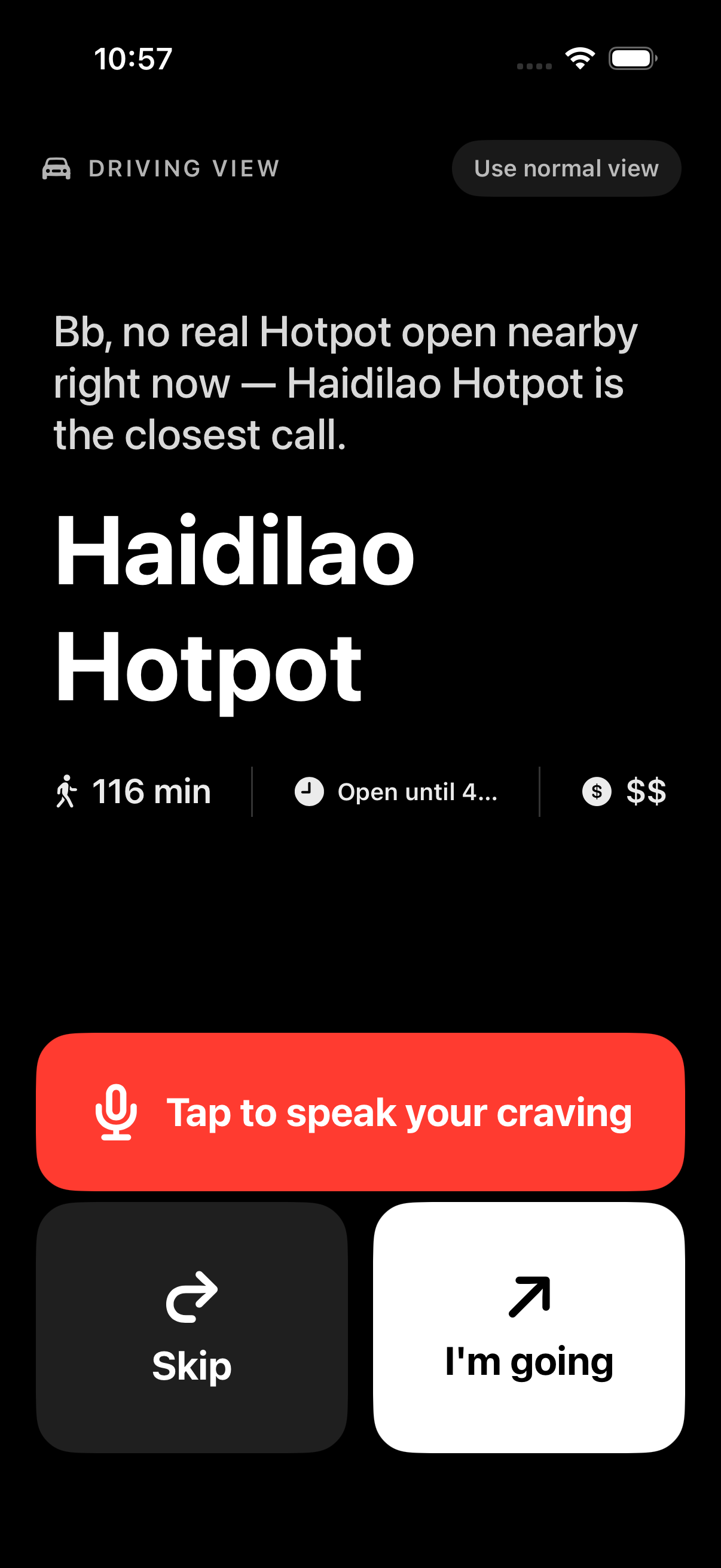
"It recommended Bob's Donuts at 11 PM — closes at 11:30."
Hours math became a first-class scoring concern. Added minutesUntilClose() to the Restaurant model — runway computed locally from regularHours + device clock, no extra API call. Recommender now penalizes <30 min runway by -40 (effectively buries it), 30–60 by -22, 60–120 by -8 — in both Eat and Cafe modes. Pick card swaps the generic "Open now" for a concrete "Open until 11 PM", and when runway drops under an hour a red "Closing in 35 min" pill renders right under the meta row with a clock-with-exclamation glyph. Same data drives the score and the warning; no chance of disagreement.
13
"Some guy named Shakil Ahmad just showed up as a bakery 25 miles away."
Two-layer junk gate. Pattern observed in the wild: someone creates a Google Maps "business" profile with their own personal name, tags it "Bakery", uploads an office-building exterior photo, 0 reviews, 0 rating, "Claim this business" flag — and Google's API surfaces it ranked by distance. The (rating == 0 && reviewCount == 0) combo is now a hard reject at the provider layer. Plus a defensive distance gate that drops any computed result beyond 1.5× the requested search radius regardless of name or quality — Google occasionally ships places with miscoded lat/lng that pass the API's own radius check.
14
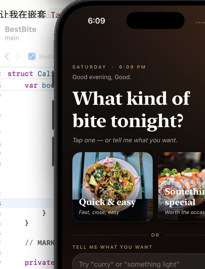
"Allow 'Bitez
这个icon 现在怎么有两个缺口?
食物也有缺口?
Bitez' to use your location?"
The submission-day catch. The CFBundleDisplayName key in Info.plist had been silently corrupted — chat-debug content from an earlier session had embedded itself into the production app name. iOS injects that string verbatim into the system permission popup. Caught in real-device testing the day before App Store submission would have shipped — a guaranteed Apple review rejection. Fixed both Debug and Release configurations and replaced the location-permission description with the proper brand copy. Confidence in real-device dogfooding restored.
15
"It said 4 min walk but Maps took me 18 minutes — there's a highway between us."
MKDirections for the recommended pick only. After the recommender selects a place, fire ONE MKDirections call (Apple Maps' free pedestrian routing API) for that specific pick. Single-flight — any new pick cancels the previous request, no TaskGroup races (the parallel version had crashed under iOS 26 beta). Only fires when straight-line haversine says ≥5 min away, since that's where freeways, water, and bridge crossings make geometry lie. The walk-time label on the card updates the moment Apple's route returns — typically 200–800ms. Haversine stays the cheap baseline; MKDirections is the truth pass.
16
"I typed 11364 in Settings and got 'Set your city' — but Onboarding accepted the same zip just fine."
Onboarding / Settings parity for location input. Centralized the city → coordinates translation in one resolveCityToCoordinates method called by both surfaces. Three-layer geocode: raw input → 5-digit ZIP gets a ", USA" suffix (CLGeocoder's well-known blind spot) → 1.1-second pause + retry to recover from rate-limit throttling. Process-cache so repeated lookups of the same text never hit Apple. Plus a stricter rule on top: both surfaces now require the city field to contain at least one letter — pure-digit ZIPs are rejected at validation with an inline "Type Bayside instead of 11364" hint. Stops the failure before it can happen.
17
"Is this 'WHAT REVIEWERS LOVE' card AI-generated, or actual review text? I can't tell."
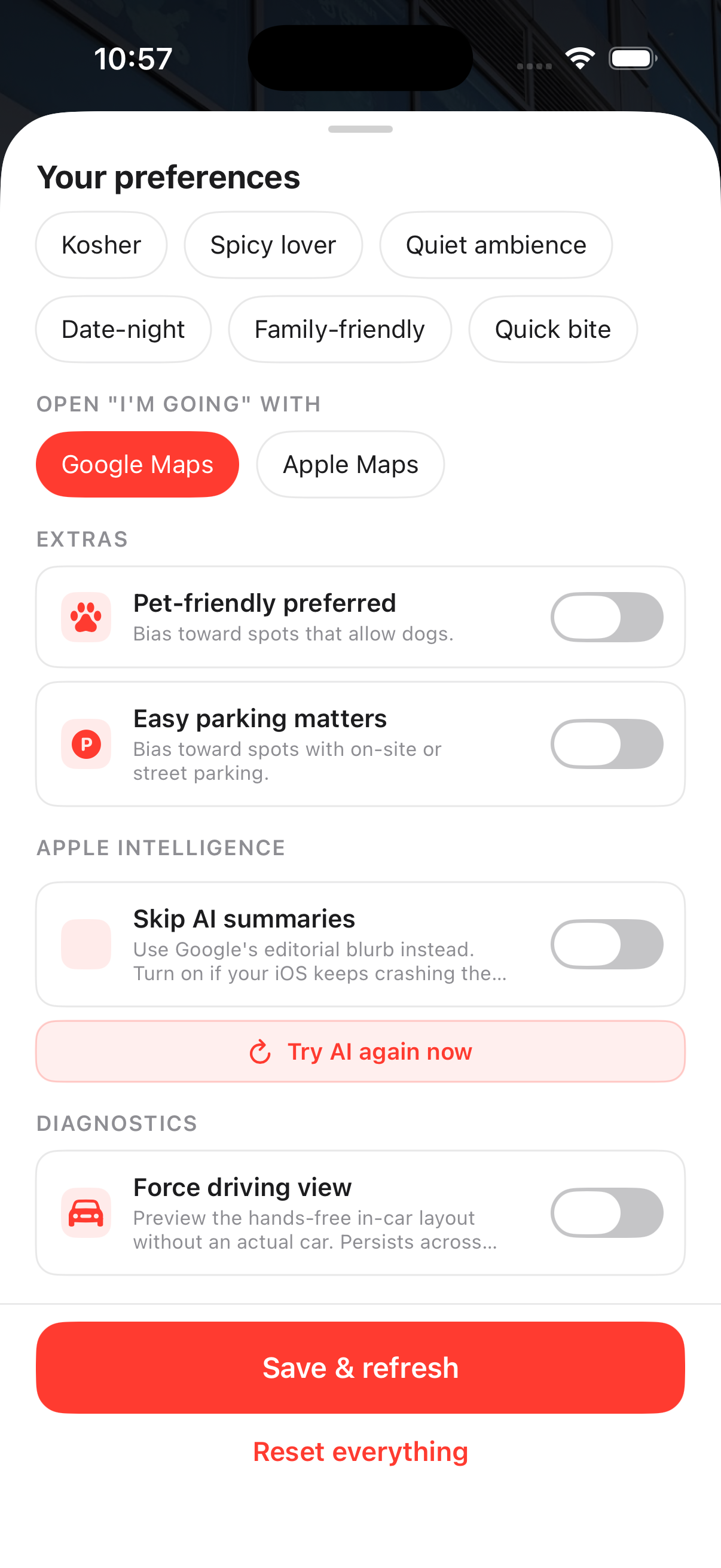
Source-attributed summary, three paths, three badges. One review-summary card body, three possible sources, three visually distinct attribution rows so the user always knows what they're reading. On-device AI synthesis → ✦ APPLE INTELLIGENCE · ON-DEVICE (sparkle icon, accent purple). Google's editorial blurb verbatim → FROM GOOGLE'S EDITORIAL SUMMARY (warm orange). First positive review unedited → FROM A RECENT REVIEW. A negative-tone token list ("terrible", "avoid", "would not recommend" ...) is scanned at every layer so the "what reviewers love" promise on the card title can't be falsified by a 1-star rant slipping through.
18
"Every time I open the app I have to look at 'What kind of bite tonight?' before I can see a pick. Annoying."
Mood Gate removed from the auto-show paths. Two paths used to dump the user onto the full-screen mood selector — post-onboarding entry and re-entry after a 30-minute idle window. Both were redundant: Home already shows the mood chips and the dish-text search button right under the greeting. Removed both auto-show triggers; the gate code stays in the project for users who specifically want the screen via the search button, but it never auto-appears. Fewer screens, no functionality lost — the kind of removal that's harder to justify than an addition.
19
"Why is Starbucks showing up when I asked for dinner?"
Eat / Cafe pool separation tightened at the API layer. Added cafe, coffee_shop, and tea_house to dining mode's excludedPrimaryTypes — Google never returns a coffee-shop primary place when the user picked Eat, so the Starbucks-as-dinner case is structurally impossible. The reverse already excludes restaurant/bar/fast-food primaries from cafe mode. Bakery stays in Eat (Levain, Tartine, etc. are real food destinations). The two contexts are now truly disjoint pools — not just differently-scored views of the same pool.
20
"After one AI timeout I lost AI for the rest of the session — and after two crashes I lost AI for good. Way too aggressive."
AI auto-disable removed; replaced with user-controlled toggle. The old "AI failed once → disable session" / "AI failed twice → disable forever" defense was meant to stop crash loops on iOS 26 beta, but the cure was worse: a single transient timeout could lose the user AI for hours. Every nil result is now just logged; every new pick gets a fresh AI attempt. The only ways AI gets disabled now are (a) the explicit "Skip AI summaries" Settings toggle (the user picks when iOS reliability isn't worth the wait), or (b) the in-session breadcrumb that protects against an immediate crash loop. A migration on first launch of this build clears stale "permanently disabled" UserDefaults flags from older builds, so users whose AI got stuck off in earlier sessions get it back automatically.
21
"I keep trying to use this at red lights but the buttons are tiny and the friend line is hard to read at a glance."
Driving mode as a whole UI shell, not a layout tweak. Detection aggregates three independent signals — CarPlay scene connect (UISceneSession.Role raw-string match, no CarPlay entitlement needed), AVAudioSession current route containing bluetoothA2DP / bluetoothHFP / carAudio, and CMMotionActivityManager reporting automotive at non-low confidence. Any one fires, the entire PickView swaps for DrivingPickView: pure-black background, 54pt restaurant name, 140pt Skip / I'm going buttons, friend line as the deterministic template (AI's 25-second timeout doesn't fit a stoplight). Auto-narrate via AVSpeechSynthesizer with .duckOthers + voicePrompt mode plays the friend line over CarPlay audio. Voice input via SFSpeechRecognizer (on-device when available) — tap mic, say "ramen", get a fresh pick. Settings → Diagnostics has a sticky Force driving view toggle for demoing without an actual car. False positives (Bluetooth headphones on a walk) get a "Use normal view" pill in the top-right.
22
"View their menu just bounces me to a sketchy website. I want to see what the food actually looks like first."
Killed the external-link CTA. Built an in-app gallery ranked by Apple Vision. "See the place" sheet renders every photo Google has for the restaurant (up to 8) as a 2-column grid. Each image runs through VNClassifyImageRequest on-device: 60+ food-related identifier tokens (food, dish, pizza, ramen, salad, burger, ...) compute a max food confidence; anti-tokens (storefront, facade, sign, person, building) above 0.5 zero it out. Photos sort food-first so the burger photo floats above the storefront, but storefronts stay visible — the user wanted to "see the place," not just the food. Zero network round-trips for classification, zero permission prompts, ~25–80ms per image on A15+. The original website still lives as "View their store" at the bottom of the sheet — one tap further, no longer the front door.
23
"The review on this card — is that a real review? Can I see the other ones?"
Review-summary card became an expand surface. Source attribution stayed (editorial / review badges), but when the source is a positive review snippet and Google returned 2+ usable ones, a tap-anywhere "SHOW N REVIEWS" toggle reveals all of them. Each expanded review gets its OWN quote glyph + body + thin separator — the first prototype shared a single quote icon at the top-left of the card and the two stacked reviews read like one giant run-on quote. Empty-string snippets are filtered out before counting, so "SHOW 3 REVIEWS" can't disagree with the number you see on expand. Single-snippet and editorial cards stay tap-disabled but render at full opacity — replacing the previous Button + .disabled implementation that dimmed the whole card and looked broken on the very places that didn't need a toggle.
24
"Why are random places with 5 ratings showing up? Those don't feel real."
Quality gate tightened at the provider layer. Old rule rejected only when rating==0 AND reviewCount<3. New rule rejects ANY place with reviewCount<3 regardless of star rating — the same gate that caught the "Shakil Ahmad - Bakery" unclaimed-listing pattern now also catches the more subtle "1× 5-star review from an owner-aligned account" pattern that flatters a brand-new listing into looking established. Applied upstream of type filtering so it kicks in for Eat AND Cafe modes. Cache version v16 → v17 so existing users' first session on the new build repopulates the pool with the new floor — no waiting for the 24-hour cache to age out.
25
A multi-day Foursquare experiment ending in a delete. The story is the discipline.
Why I tried Foursquare in the first place. Google Places — the only data source the app uses — has documented gaps. There's no structured noise level ("is this place quiet enough to read in?"), no structured wifi info ("can I open a laptop here?"), and no review-source voice distinct from Google's own reviewer base. For the Cafe mode I'd just shipped (builds 10 / 11), those three gaps are exactly what users care about. Foursquare publicly advertised all three as structured fields with a generous 180k-call / month free tier. On paper the integration looked free: a single per-pick enrichment call gives me the missing axes, and "FROM A FOURSQUARE TIP — DIFFERENT CROWD" surfaces a non-Google review voice as a separate card so the user sees the place through two crowds, not one. Did the full build: created a Service API key, switched to the new places-api.foursquare.com host, added Bearer-prefixed auth + the required X-Places-Api-Version date header, modeled the per-pick enrichment (foursquareNoiseLevel / foursquareHasWifi / foursquareTips / foursquareVerified), wired it into cafeScore as the strongest noise signal (quiet → +24, very_loud → −28), and shipped the blue-accented review-source card.
Why I deleted it. Foursquare's free tier returned 429 "no API credits remaining" on every app request — but a curl test from the same machine, same key, same minute returned 200 with 179,960 monthly requests still on the counter. The diff between the two requests was the fields= parameter: attributes and tips — the exact two fields I was integrating Foursquare to get — are categorized as Premium Data and require per-call paid credits even when free-tier quota is untouched. Without those fields, the integration provided exactly one usable signal: the verified boolean. One boolean is not worth a per-pick HTTP round-trip, the 429 log noise, the extra cache-invalidation surface, the schema risk on the Restaurant model. Two options: pay for Premium credits to keep the original value proposition, or accept that the free-tier reduction made the integration a net loss. I chose the second one. Deleted enricher, the AppCoordinator hook, the four Restaurant fields, the Recommender wiring, the blue tip card. Cache version bumped v17 → v18 so the on-disk shape matches in-memory. Left a stub file with this rationale so a future me doesn't try the same experiment twice.
What's documented here is the deletion, not the build. Shipping a feature and removing it once the economics break is a separate discipline from never building it.
26
A recurring fatal-error "Range requires lowerBound <= upperBound" crash, traced into libswiftCore on a background queue inside FoundationModels.
FoundationModels turned off until iOS 26.6. Hard-killed both narrate() (friend-line + reasoning rewrite) and the AI fallback inside parseDishIntent. Every escalation of input sanitization across the last weeks — asciiOnly, markdownBalanced, escape-all-markdown, AttributedString parser short-circuit — bought roughly a week of stability before a new edge case landed in the tokenizer. The trap is a Swift precondition inside Apple's framework, on a background queue, untouchable by try? and unreachable from our code. Friendlier and more honest to route around: ReasoningEngine's deterministic friend-line templates and the 80+ entry keyword-dictionary dish parser cover the same UX surface (warmer copy lost, never crashes). Re-enable is two return nil deletions when iOS 26.6+ ships a tokenizer fix. The honest story is choosing reliability over a marginally-warmer sentence — the same kind of trade-off as build 25's delete.
 Enter password below to view
 Enter password below to view